
Data analysis and interpretation problems are given to test how keenly you can observe things and not to test your ability to calculate.Let us now see some data analysis and interpretation tricks to get the answer quickly without much calculations.
Study the following graph carefully and answer the questions below.

(1)In which year the percentage increase or decrease in the production of company B to that of company A was maximum?
Basic concept
First of all we shall look at each bar as group of parts and understand the concept of parts.
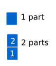
 for example In the above bar chart diagram, In 2007 company A has 1 part and company B has 2 parts
In 2008 company A has 3 parts and company B has 4 parts.
Steps to find percentage increase or decrease
We shall follow the below steps to arrive at our answer
Step 1:Count the number of parts of company A and company B
Step 2:Compare the number of parts of company B with company A for all years.
Step 3:Check which year the difference in the number of parts is maximum.That is the year the percentage increase or decrease is maximum
In the above example we notice the following
2007
Number of parts of A=1
Number of parts of B=2
Increase=1
2008
Number of parts of A=3
Number of parts of B=4
Increase=1
2009
Number of parts of A=7
Number of parts of B=6
Decrease=1
2010
Number of parts of A=8
Number of parts of B=5
Decrease=3
2011
Number of parts of A=7
Number of parts of B=9
Increase=2
2012
Number of parts of A=6
Number of parts of B=8
Increase=2
We observe that in the year 2010 the number of parts of B is 3 less than the number of parts of company A so 2010 has maximum percentage decrease in comparison to the other years
Ans In the year 2010 percentage decrease in production of company B is maximum compared to company A.